My Blog Business Cards
June 27, 2008 Posted by Tyler CruzSix weeks ago I made a post showing my corporate logo and stationery. The stationery was pretty good, and I was very happy with the logo.
I will be attending BlogWorld in Vegas this September and I thought it would be a good idea to have business cards to give away that showcased my blog instead of handing out ‘boring’ business cards of my corporation.
Since I had used the graphics and design services of TheLogoCompany for my corporation, I naturally went back to them to do my blog business cards.
Unfortunately, I was extremely disappointed with what they came up with. The cost was only $50 or $60 for the actual design work, but I did provide a logo and mascot for them to work with.
Their initial mockups made me want to puke… they didn’t even read my detailed description of what I wanted and used my corporate logo on the cards. I could easily tell that they had simply pasted my information and graphics onto pre-made business card templates.
And even still, they looked horrible! Business cards are all about representation. I don’t want to give out a business card that looks like garbage. So, I of course asked for more revisions. To TheLogoCompany’s credit, they do give you unlimited revisions until you are happy with the final result, but the process of e-mailing back-and-forth and waiting sucks.
Below are the various revisions they sent me. Some of them were so appalling it made me shake my head. I’m pretty sure that they outsource their business card design services to some cheap overseas designers, as they don’t compare at all to the high quality logos they produce.
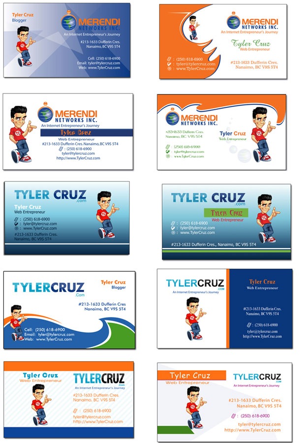
I could have made better designs myself. Some of them honestly look like they were made by some 9-year-old… Remember they had my mascot and text logo to work with. I even gave them my color scheme… and some ideas!
Anyhow, I finally spotted one revision that would work, but I wasn’t all-too-thrilled with it. I asked for more revisions on it, and was presented with the following options:
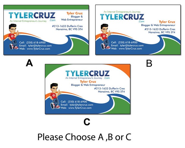
I went with A and asked for a couple of subtle changes, and below is the final result. I know that the alignment on the sides may seem a bit too far, but that’s actually done for printing/cutting reasons.:

So in the end, I was satisfied, but I had to push hard to get something decent.
I’ll never go back to them again for business card design, but still recommend them for logo work. They do awesome logos, but apparently horrible business card design. I still think they must outsource them.
I must say, after my disappointing experience with business card design, I started exploring alternative options for printing. That’s when I stumbled upon the concept of metallic business cards. The allure of these Metal Kards was undeniable; the elegant shine and unique texture seemed perfect for making a lasting impression. I couldn’t resist the temptation to try them out for my next batch of business cards. So, with newfound enthusiasm, I began my search for a reliable printing service that offered Metal Kards, and that’s when I came across services like printing dublin.. Their positive reputation and commitment to quality gave me the confidence to give metallic business cards a shot. I can’t wait to see how they turn out and hope they will further elevate my professional image.
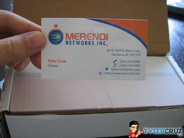
I learned my mistake from using my GMail address on my corporate business cards, and so created the e-mail tyler@tylercruz.com specially for these business cards.

I’ll be passing them out at BlogWorld to anyone I get into a discussion with, so perhaps I’ll give you one 😉
I’ll be using my corporate digital business card for anything non-blog related such as for PublisherSpot if I go to conventions such as Ad:Tech.
51 Responses to “My Blog Business Cards”


Looks like it came out decent enough (a lot of colors though). But I agree, some of those initial designs are really bad. Looks like they were made by pasting your pre-made assets on top of something that comes out of those cheap “logo creator” software programs lol.
Thanks for being open about the difficulties even if they ended up doing well in the end too. A nice alternative to all the BS you see out there with people worried about hurting feelings or messing up paid reviews and such.
Hey Tyler, they don’t look too bad (the ones you got done that is) I was just looking today to get some business cards, too bad you didn’t have a good experience there. Got any other suggestions?
Holy smokes the initial ones were crap. Is that red lettering on a green background?! LOL.
The final one looks good though. I probably would have gone with a small “C” on the .com part myself but the design looks pretty good.
The colors kind of remind me of the Canucks jersey for some reason. 🙂
I honestly would pick A Style
how did that one design end up with purple writing :S
Sorry buddy, but they’re up there with the worst business cards I’ve ever seen.
I don’t see how you’re smart enough to realize that your logo, business cards etc reflect your personal brand and businesses, but you still use the services of a low end agency.
I’m serious about my brands and I budget $5,000 for a logo and business cards. I would say that’s a medium level investment (ie. it would be easy to spend twice that or more).
More effort required.
That aside, I love your work.
I am happy everything worked out for you.
good design for business cards for corporate line .
Thanks
http://www.uvcards.com
Not a good idea to be putting your cell number so publicly on your blog.
Anyone wanting to find out my contact details could do a WHOIS query on any of my domains or look “Tyler Cruz” up in the white pages…
that is so cool :), btw where is Nanaimo ?
Vancouver Island, British Columbia, Canada
I guess the major question would be, would you recommend these guys to anyone else who wants to get their business cards designed.
Judging by your post I take it you will say no :p.
I personally would have picked B myself.
I still have issues with the text alignment, even in your final product.. Had I known you were looking for business cards, I would have referred you to the company that did mine – It’s a small operation in Canada, but their work is just out of this world!
Care to share who did yours Zander?
I would of picked option A as well. Though how many bloggers actually have business cards? I’m not saying its not a good thing, in fact i want business cards for both my blog and for my web development site.
I think you made the right choice by going with A.
I mean, they all look okay… personally, I would’ve picked C… but I guess that’s just me.
Jay
My apologies Tyler but they all look horrendously poor. The text alignment is way off and the visuals are nauseating.
On a side note, the Tyler caricature does not look remotely like you.
I agree with Jon for sure. There’s no need for me to go into details about logos and business cards, but paying anything less than $200 (and thats on the VERY cheap end) and you’re going to get garbage. You have a successful company and blog, shell out a grand and do it right. Btw – I very much dislike your corporate logo, next year you’re going to want something different as it’s going to be so dated (I feel it already is).
I agree about the company logo. Its just not good.
The final looks a lot better than the mock ups they gave you and as a designer i know they outsource it as well. You can just tell in the patterns and colors alone.
[…] the networking potential of the blogging conference and that’s why he got himself some new blog business cards. While the initial concepts weren’t so great, the final product is looking pretty sharp. […]
Tyler, Tyler, Tyler… Again, I see too many references in your post to “my corporation”. It’s THE CORPORATION. It’s a separate legal entity. It’s like being married. You can’t say you are your wife right? You work for the Corporation. It’s a totally separate distinct legal entity. If you don’t recognize that, there is no benefit to the protections afforded a corporation structure. It’s a business, you are a person. The person works for the business. Okay, sorry about the rant, I just don’t want to see you diminish the value of your brand and the value of the Corporation that you work for.
On a side note, care to mail me a business card? Both? I like them…
oh dear, the type sucks so hard, it looks so ‘template’ -ish
..
Why didn’t you get the mascot designer to do the cards? Or whoever designed the blog? They could have looked really cool with some of the various elements from TylerCruz.com, unfortunately I think they look seriously un-professional.
Greg
Something like this perhaps…
Greg
Sorry last blog comment didn’t work… here is the URL
http://www.gregfindley.com/tylercard.png
Thanks,
Greg
I like that.
Thanks DotDriven,
Just something I knocked up in 5mins to prove that Tyler could have an effective business card just using a few of the elements from the site. Wouldn’t take more than an hour to put together as a hi-res visual with bleed ready for a printers 😉
Do you still own Chess Forums?
Hi Tyler,
No afraid not I sold that some time ago.
Tyler….who did your mascot logo?
Ray
Personally, I didnt find any of them that appalling. (Well, except the 2nd one from the top wid the ginormous orange wave next to teeny Tyler.) Anyhoo, please fix my avatar on MoVa! Its disappeared or something. Eck.
Hey, the first one didn’t look too bad, even if it was a template. They seemed to get worse the further I scrolled down but. You are the only guy I know who has a business card for his blog you know!
I would have went with “A” myself
Nice card. Where is the big after party in Vegas? I’m heading for BlogWorld and coming from Toronto Canada! Maybe I will see you there!
I would have gone with A too….and I like what you ended up with.
Now I want some! By the way, you didn’t have to create the new email tyler@tylercruz.com, you could just have forwarded the mail, or maybe you already did that 🙂
I like your business card..
I must have one…
I have read that listing yourself as owner of a corporation has on impact on the liability protection of of the corporation itself. Might want to confirm with a lawyer before handing cards out. Might be better listing yourself as President or CEO
They absolutely outsourced that stuff. Heck, I–with no graphic design talent or experience–could have made those revisions, ha. I would have gone with A as well.
The design you chose is really good compared to the other designs.
I think the one with the wave on the bottom looks the best. The other ones don’t look as professional
an elegant and professional design. look much pretty
Dude, hire a professional graphic designer. You get what you pay for! 😉
,..] https://www.tylercruz.com is other useful source of tips on this subject,..]
Nice chose the card you picked is by far the best one.
Often we forget the little guy, the SMB, in our discussions of the comings and goings of the Internet marketing industry. Sure there are times like this when a report surfaces talking about their issues and concerns but, for the most part, we like to talk about big brands and how they do the Internet marketing thing well or not so well.
onlineuniversalwork
[…] 名片来源:Tylercruz.com […]
Honestly speaking the first ones were really terrible. But at least you got a better card in the end. It’s too bad for The Logo Company, poorly outsourced work might ruin their reputation eventually if they don’t step-up their game.