Merendi.com Revamped
July 16, 2008 Posted by Tyler CruzI originally registered Merendi.com on January 12th, 2004 making the site 4.5 years old. I use to be active in various webmaster forums, particularly Sitepoint, and I was often asked by various webmasters what sites I owned. I therefore made the site to act as a central hub to showcase my various sites.
Since “Merendi Networks” is now “Merendi Networks Inc.” and a fully functioning legal corporation, I thought it was time to update the site with a new look and updated content.
Below is a screenshot of Merendi.com’s old design, which I created myself. It was basic, but nothing fancy was really needed. However, as the number of websites I owned grew, so did the length of the page since the entire site was only 1 HTML page!
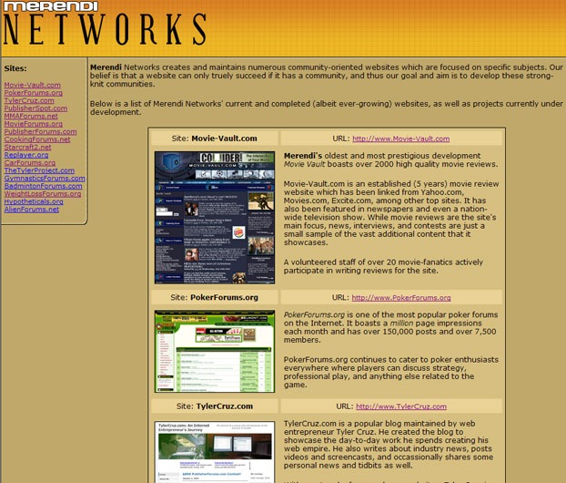
While I tried to update the descriptions and details of each site as best I could, I was often too busy or forgetful to update the descriptions and screenshots, so a lot of them were very old and outdated.
For my new design, I hired an old acquaintance of mine named Bryan Le. Some of you may remember him from from BryanLe.net. He was originally a web designer who then started a blog like me and tried his run as a web entrepreneur for a while. He later closed his blog and is now back to designing.
If you are interested in his services, he charges around $250 per design (if you already have a logo) and $125 per additional page. If you need it coded with validated xHTML/CSS he will charge around $550.
I personally paid $310 for the design and got him to design two pages, but got a bit of a deal since I’ve worked with him in the past and offered to give him a plug in a blog post (and here it is!).
I only got him to do the design as I then hired my friend Stefan from InstantCoding.com to code the designs into valid xHTML and CSS for me. I paid $160 to get both pages coded, but got a bit of a discount since I’ve worked with Stefan many times before and talk to him nearly everyday on MSN.
Even so, InstantCoding is quite cheap, normally charging $129 per page or $249 per CMS coding such as WordPress/vBulletin. I recommend them – Merendi.com was nicely coded, is cross-browser compatible and W3C xHTML and CSS valid.
Here is Merendi.com‘s new design:
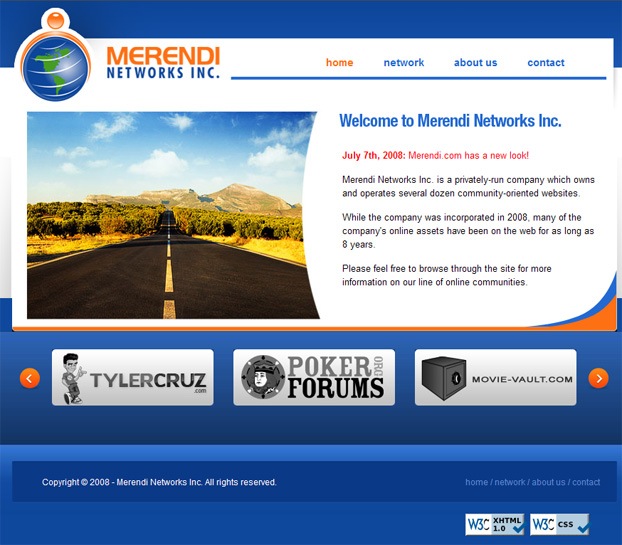
The site uses the company’s corporate colours and keeps a clean and professional look while still being pretty and entertaining.
The 3 rectangular logos at the bottom each turn to colour when the mouse hovers over them for a very basic but nice effect. They can also be rotated by clicking on one of the arrows on either side of them, showcasing each of the corporation’s sites and linking to more information about the corresponding site.
After the design was finished and coded, I spent many hours creating all of the subpages and adding up-to-date descriptions of each site.
Yesterday I spent 8-9 hours working almost exclusively on the contact page. I don’t know PHP at all but managed to fiddle my way through by making a contact form with server-validation and spam protection. I couldn’t find any PHP contact form scripts that were half-decent so I just made it myself (I did grab some code from various examples and free scripts on the web though).

The new design is a dramatic improvement over the original one, and with the additional pages it is also much more functional – there was absolutely no contact information on the original design.
I might consider integrating a network-wide advertising system on the site such as OpenAds for advertisers to use as well.
So what do you guys think of the new design?


The design is very 2.0ish (which puts it up to date), but I must say that the double gradient in the bottom part is a bit disturbing. How about eliminating the second one?
Also, I felt it was a little strange to have the date displayed next to the “new design!” note, because that made me want to read other news/posts and there weren’t any.
Apart from those two details, the design looks great and I must say your money was put in good use! Congrats!
Thanks for the Comments!
It seems that the coder used only a .JPG rather then using the master .PSD files that I provded because theres a lot of errors that appear on the .JPG and live site, then there are in the .PSD.
The coding isn’t exactly stellar either, and really takes away from the look and feel of the site that I had originally intended.
Either way, Tyler is happy, and the presence is much better then what he had before. So I’ll put this one down as a successful project.
Hi everyone!
I’m looking forward to everyone’s comments and feedback on the design! It’s great to see it live, although the front end needs some work.
Here’s the original composition:
http://www.codedpreview.com/?view=1027
There’s a problem with the footer which makes it LOOK like a double gradient, but the first gradient is actually not supposed to be there … it seems like a coding issue.
Stefan and I have done business in the past, but it seems like he didn’t do too well on this one. I’m not sure whether or not its because Tyler didn’t catch the bugs (boy, I wish Tyler had asked me to review the design before it had gone live, or before he had signed off on the coding) or what.
Anyways, I am availble for work – the prices that Tyler has put for me ($250) are no longer accurate, and prices start at $350. If you’re interested, you can reach me at canitgo [at] gmail [dot] com.
Actually, to set the record straight, InstantCoding DID originally code the design ver batim as to the PSD I was given, however I later requested the bottom to be switched to as it is now.
It had too much vertical scrolling on the inner pages with longer content, and I prefer the way it is now.
The first impression I get is a spam landing page. I think it’s the giant stock image that overtakes everything.
Also, adding a header that at the very least said “Look my network of sites”. As it stands now, the three site buttons are just floating out there with no explicit indication of what they are.
Yes, it kind of reminds me of one of them domain holding pages you see when a domain hasn’t been setup yet. It also reminds me a bit of http://www.escalatemedia.com/ color / idea wise – but no where near the quality of that site.
The version the designer posted was slightly better. At least it looked right. The current version looks thrown together with the double gradient at the bottom and the wrong colour on the rounded edges of the white box – that just looks amateur.
With that said, I guess it serves it’s purpose. I guess it’s worth the small money paid but isn’t anything worth shouting about. Your logo is the base of it which is truly, truly awful. You have some great logos on your forums / sites but really let yourself down with this one.
It looks pretty decent to me, Web 2.0 is king. I do like the original look (which Brian linked to above) more than the current one, but as long as you’re happy with it all’s good.
I do think you overpaid on the design and coding though, there are plenty of top notch designers on the various webmaster forums that will do you a killer job at far less than what you paid 🙂
Now I don’t want to sound negative, but rather up building. The old Merendi website was like the style of 1990 and totally looked like shit :). But the new design is totally awesome and I think you did an excellent job with it Tyler.
Now you’re business is looking like pro.
Overall nice page, but:
http://img148.imageshack.us/img148/463/mupo6.png
– the edge of the logo looks unclean
– why is there a blue line at the left
– why is the background of the rounded corners not the same as the background next to them.
I think you guys are nitpicking, for it’s purpose it does the job very well.
Question thougyh Tyler, I haven’t seen you mention Replayer in ages? Is it actually still in dev or just on the backburner indefinately?
Well technically everything is still in development…
I’ve always had my hands full with a million projects and have had no time to put into older ones.
One day I’d love to get it going again but don’t know when I’ll have the time..
I personally would like to see a blend of both designs. I think the new design obviously looks fresher, but the “screenshots” from the old site looked great. It provides more of a showroom feel to the user so they don’t necessarily have to click on the links if they don’t want to (even though you want them to). Anyway, it serves the purpose of a cleaner look. Hope it helps convert, which is all that really matters anyway.
I really like it. I mean, it’s just a portal for those who want to see what you’ve done, and I think it fulfills that need.
Its a clean design that serves the purpose….not great but not bad….I like it
Good stuff i went ahead and signed up to a few of those forums are they all yours?
They’re all the corporations, yes.
It is much better than the old site, however the designs always get worse when clients step in and tell the designer what to change. This is why the design that Bryan linked to looks better than the coded version.
You eliminated it due to vertical scrolling? Are you kidding me? That’s the worse reason too. It may now look fine on your screen b/c you don’t have to scroll, but not everyone has your resolution. Plus, webpages are meant to scroll vertically, it would have been different if you said horizontally. Plus, if it was that big of a problem, spacing could have changed and/or font sizes to change the scrolling, but not the design.
And for Jason to say that price is high is ridiculous. To get a good design and good coding, you should be spending at like $1,000. Under that, you’re most likely taking a risk.
Anyways, better than the old site – and I agree, the logo for Merendi Network is….bad.
That is a huge difference from the old one, I like it 🙂
By the way, are you a robot? I have no idea how you have time to manage all those websites while I can barely manage my blog!
How do you manage all those sites? Maybe you have a helper or something.
…most of the forums are pretty inactive.
Maybe now some of those commenters who keep mockingly asking me what I spend my time working on (after all, how hard is it to manage a blog, right?) will understand why I’m often busy.. 🙂
Would be interesting to see a breakdown of your revenue between your blog / forums / whatever else.
Here’s a rough breakdown:
https://www.tylercruz.com/i-made-over-100000-in-2007/
For this year so far between sites it’s something along the lines of:
PokerForums.org – 70%
TylerCruz.com – 15%
Other – 15%
I found a bug: The link to publisherspot.com is broken because it says publisherpot.com (without the S)
Otherwise I like the site.
/Andreas
Thanks – saw that before but forgot to fix it.
Fixed now 🙂
Bryan did a good job of the design considering the poor logo as others have mentioned already. Quite why you have the large stock image I’m not sure, why not have a small screenshot of your latest project to launch? or something more appropriate to the site? Greg
Looks amazing Tyler 🙂 Great stuff!
-Mike
The revamped design looks amazing!