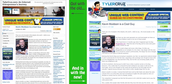
My New Blog Design!
October 27, 2007 Posted by Tyler CruzMy new blog design is finally up and running. How do you like it?
For those of you who subscribe to my blog through an RSS aggregator, you probably have no idea that my new design has been up for a couple days now. If so, go visit TylerCruz.com in your browser and take a look at the new design!

I’ve already received a number of praise and kudos in the comments of my last post, and several people even e-mailed me stating how much they liked it.
My old theme was a simply a heavily modified version of a free skin. I think I did a good job of customizing and making it my own, and was fairly happy with it, but it was time to move on 🙂
Here is an overview of the changes and improvements:
Theme & Integration
The new design is very well themed, all revolving around the look and feel of my mascot/caricature. All the site colors, fonts, and images work together to complement one another. I especially like the icons and images next to all the subheaders.
I think most sites don’t concentrate enough on theme. Keeping a theme uniform and consistent throughout really helps to brand your site and make it unique and fun. A couple of my other sites with good themes are Movie-Vault.com and PublisherSpot.com.
Cleaner & Crisper
I think my new look is a perfect balance of visual eyecandy and clean, crisp design. There are just enough graphics and colors to complement the content, but are not at all overwhelming or overpowering.
Small touches such as larger title fonts and smaller side links help achieve this effect.
“And quotes such as this one now display much nicer than the awkward indent system my old theme used.” — Tyler Cruz TylerCruz.com
Resolution & Content Space
One big difference between my old and new themes is that the new one is made for 1028×768+ resolutions while my old was viewable in 800×600.
It’s almost 2008 now, and the vast majority of users use 1028×768. For those who still use the archaic 800×600 resolution, they won’t experience a big shock when viewing my theme since I think the majority of sites out there these days aren’t built for 800×600 resolutions anymore.
As a result of being built for a larger resolution, the main content area is wider than before (about 300 pixels), which allows for much greater improved post reading. One of the main reasons I wanted a redesign was because I had very little room to work with before. In addition, I can now add larger images to posts.
Previously, I was constricted to a maximum of 449-pixels wide. This often didn’t let me post images or screenshots as nicely as I would like to, and often had to do a lot of photoshopping before being able to post a decent image.
Now, however, I can easily fit in a 600-pixel wide image. I will also be able to post in videos such as YouTube and Google Video without resizing them.
Features & Functionality
In addition to a complete design revamp, there has also been a number of improved features:
Guest Commenting Enabled
I’ve once again set it so that non-registered users can comment on my posts. I had to set it so that only registered members could comment as I was getting too much spam and trolls pretending to be other people. I’ll have to set guest commenting off again if that reoccurs.
This seems to have made a difference already, when my last post received 16 posts.
Improved Avatar System
I removed Dan’s Avatar Thingy, which was a plugin that allowed registered members to upload and set an avatar which would display when they commented on my blog. I replaced it with the MyAvatars plugin which does the same thing, only it automatically takes the avatars from the user’s MyBlogLog or Gravatar profile.
Upgraded to WordPress 2.3
I was previously running version 2.2, and felt it was a good opportunity to upgrade to 2.3 while installing a new theme at the same time
Advertising Updates
Updated Advertising Page
I updated my advertising page with new stats and numbers (all behold my powerful new PR3!), and now state when an advertising slot is sold out.
728×90 Leaderboard Price Increased
I increased the price of the top sitewide 728×90 leaderboard by $5, from $80 to $85. The price increase is minor, but an increase nonetheless. I currently have two people on the waiting list for it, and the current advertiser has been renewing. I always price my ads based on demand.
Added 125×125 Sidewide Banner (New!)
I’ve added a new banner slot and advertising opportunity on my blog, a sitewide 125×125 banner which will appear in the left column.
All my ads are completely sitewide, 100% RON, and with no rotation ensuring maximum exposure.
I’ve priced these at only $15 a month! This price will almost inevitably increase shortly, but since I price according to demand and just added this slot, you have the chance at grabbing it for cheap!
To Conclude…
My new design is up and running and I’m very happy with how it turned out. Let me know if you find any bugs or browser issues, etc.
I have a few very minor things that I need fixed and modified, but they should be resolved soon; for the most part my new theme is pretty much complete.
How do you like it? Comment in my new guest-enabled blog and share your thoughts!


Hey Tyler – I love the new design. Who designed it for you?
– Martin Reed
Ah, not to worry – I just saw the link in the footer!
– Martin Reed
Love it Tyler! Looks nice and crisp and I love the emphasis you give on the top banner.
Absolutely love your new design, especially the header. I love the animated you..
I love those little card icons in the sidebar! Looks Great!
One word – awesomeness.
is that even a word?
Tyler, much nicer and much more professional design. Good work.
I’m going to struggle to look at mine at this point , awesome work. I actually looked at graphics before I looked at a posted word for several minutes
Looks great. The header is awesome.
Andrew
Looks great man, been waiting for you to update it for awhile now 🙂
simple yet effective design.
Looks like a good design, well done.
I think it looks great.
Your new theme certainly looks nice.
cool … how i wish i’ve a better design for my blog …
cheers …
Great design, I really like it 🙂
Wow Tyler, the new layout looks great! Love the cartoon of you at the top 😉
looks really good tyler. how much did it cost. is it taboo to ask?
[…] that I’ve announced my new blog design, I thought that it might be interesting to learn that I received my new custom theme absolutely […]
[…] Tyler Cruz Has A New Look! […]
[…] My New Blog Post, I unveiled a new advertising slot: the sitewide side 125×125 banners. Since I usually like to […]
Theme is nice man, but the logo is what truly makes it.