My Corporate Logo and Stationery
May 9, 2008 Posted by Tyler CruzSince I now own a corporation (Merendi Networks Inc.), it’s only natural for it to have a professional logo. In addition to acting as the framework for the new site design I’m going to have done (sometime…), a logo acts as corporation’s identity: the font, the colour scheme (which is them used as the official corporate colours), and imagery are all important identifiers that help show what your company is about.
The globe represents the fact that the corporation is connected throughout the world with its network of sites. The orange emblem behind it represents community: it should resemble a person hugging, or embracing, the globe since most of the sites in the network are community-based. Together, the globe and emblem portray that Merendi Networks Inc. manages community-oriented websites worldwide.

The old logo designer I used to use for many of my past sites wasn’t responding to my e-mails, so I had to look for another logo company. Fortunately, this wasn’t too difficult since there is certainly no shortage of logo designers out there.
However, I am an extremely picky person when it comes to design, as any past designer I’ve hired will tell you. It comes from my need for perfectionism and my OCD attention to minute detail.
I ended up going with a design firm called TheLogoCompany as their portfolio had impressed me, and I was NOT disappointed. In fact, they surprised me. Since I’m an extremely fussy client when it comes to design work, I usually ask for many revisions until the end result is perfect (in my mind), or near-perfect.
mebeliRight off the bat, about 3 days after ordering, I was sent me 6 completely different logos to choose from. The nice thing about TheLogoCompany is that they have 5-6 designers, and will have each of them create a logo for you. This harnesses the creativity power, giving you completely different takes on your logo. If you had just one designer send you variations, there will always be an element of the particular designers style in the design.
After a lot of thought, I ended up going with the logo with the globe:

However, I had a number of minor revision requests for them. Believe it or not, but TheLogoCompany will give you unlimited revisions until you are 100% happy with the end result.
In fact, they offer a 100% satisfaction guarantee, which is pretty amazing (stupid?!).
I was expecting perhaps 4 or 5 different revisions to choose from, but ended up with the following:
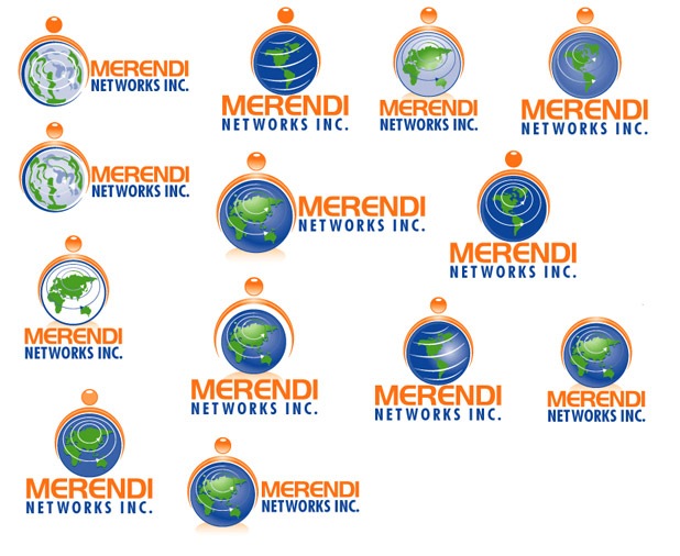
It was extremely difficult for me to choose one, as there were many good candidates, but I finally chose one… and again asked for more small changes.
And, in response, TheLogoCompany sent me many more revisions to choose from. It’s funny, because I never thought I’d ever find a design company that could actually overwhelm me with their attention to detail.
After the final… final… final… final… logo was chosen, work proceeded onto the stationery design I ordered as well. They sent me 4 concepts, I chose one, and… as you should expect by now, asked for a few revisions.
Here are the designs for my letterhead, business card, and envelope packaging:
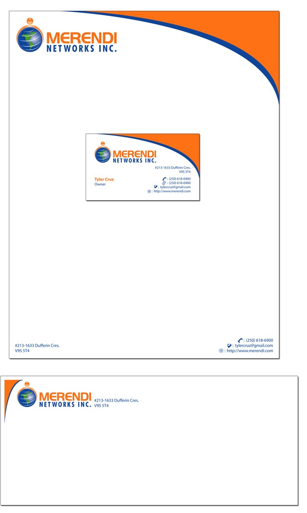
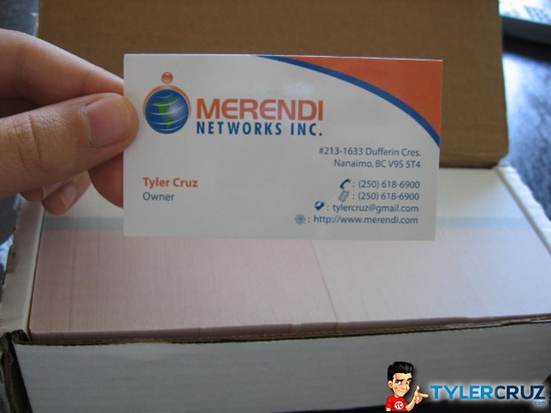
I also ordered 500 business cards. They are pretty nice and glossy 🙂
I’m probably going to get them to create a business card design for my blog and order 500 to give away when I go to BlogWorld in Vegas in September. Maybe I’ll give you one!
I highly recommend TheLogoCompany. In addition to the obvious examples mentioned above, they simply know what they are doing. They know their logos. If you browse through their site, you’ll realize that they are complete professionals in the design world. They will create your logos and give you formats for all the design standards and print shop formats. They instruct you on the differences between emblem-based logos, textual-based logos, and graphic-based logos. They produce all of their logos in vector format for unrestricted size usability…
Best of all, they only charge $149 per logo! It’s pretty ridiculous, I know, considering the quality and all the professional services you get (I’d have gladly paid $500+ for what I got). They explain why it is priced so low in their FAQ:
“Our logo design service makes no profit. This is called a loss leader product. We do this so that you will be confident to try us out and sample the quality. We would love to have you as a client for life and have you buy all your graphic design services and professional printing from us. This way we both benefit from the deal long term.”
I must admit, it’s a very interesting marketing tactic, as it worked on me. I’ll most definitely be returning to them for any logo and print-graphic work in the future.
Below are just a few of the logos taken from their portfolio to give you an idea as to the quality of the designs:

Here are some more perks:
-
You get a minimum of 3 unique logo design choices to choose from. I got 6.
-
Turnaround time of initial logo design choices is just 3 business days or sooner.
-
As many as 5 designers work on your initial choices for maximum creativity and choice.
-
Unlimited revisions until you are 100% satisfied with your new logo.
-
100% “Money Back Guarantee” right up to your acceptance of the final logo design.
If you’re not convinced yet, then nothing I say will convince you. For everyone else, the site is TheLogoCompany. Don’t forget them.
Anyhow, what do you guys think of my logo for Merendi Networks Inc.? Maybe I’ll get them to design the website too…


Sweet Logo Tyler! . Their Portfolio looks pretty damn good too. How much Did the cards cost ya? Did you get them online ?. Naa…The blog design looks awsum right now.
Owner of a corp.? Interesting, perhaps you should speak to your accountant!
Very professional. It looks good.
Nice logo, looks professional, may have changed two things – 1. Changed your gmail address to tyler@merendi.com and “Owner” to “Managing Director” or “Founder”.
Wow nice i really like your logo they did good job for pretty cheap price i might use them in the future.
The logo is pretty impressive. But I wonder how you could select from all these beautiful logos – it’s a difficult task itself.
I am somewhere feeling very nice and jeolous about your business cards and all – in a good way! It inspires me to form my own company and have such nice business cards :).
That sounds like a great value for the price you paid! Something about the logo reminds me of Cingular/AT&T though. It’s the orange plus the swirly globe.
I thought so too, and it certainly does resemble it: http://images.google.com/images?hl=en&q=at%26t+logo&gbv=2 but I felt it was different enough as to not have that much of a similarity. They are a ball, not Earth, and their ‘lines’ are representative of a connnection, I’d presume.
It’s pretty much impossible to create a logo these days that won’t have similar-looking elements to others… just look at 90% of the web logos made in the late 90’s that used the Nike “swoosh” effect in some fashion 🙂
Wow isn’t it great that you they try to make your logo “look global. When the only part you can really see is America, and a tiny Europe. Haha typical
I actually thought about this carefully when selecting from the revisions. The problem with selecting a truely global earth where all the continents were shown is that it made the globe look flat.
I then thought about choosing one of the silver ‘generic’ earths, but felt it was a bit too abstract and might not convey “Earth” immediately to some people.
I ended up going with North America since the corporation is based there 🙂
Worth the money if I see that 🙂
You put a gmail address on your business card?
Yea, the gmail address is the only thing I would have done differently. It doesn’t look professional at all :S
How much did you pay for your business cards Tyler? I get mine from an online company and wanted to see what the cost is for you to get those cards.
Well, it was part of a package deal. I got the logo, stationary design, and 500 business cards for $289.
Nice design…but why the gmail.com address? It’d take you all of 30 seconds to setup a tyler@merendi.com forwarder and look 100 times more professional?
Exactly what I was thinking – it’s so unprofessional especially compared to the custom stationary, etc.
And what sort of position is “Owner”?!
I actually do have tyler@merendi.com set up… but this wasn’t done until after the cards were already shipped.
To be honest, I actually find tylercruz@gmail.com to look quite professional myself… I guess since I find Google to be very high quality and professional.
But if I see Hotmail addresses I freak, so I can certainly understand where you’re coming from.
I’m confused by your choice of name ‘merendi networks’. I personally feel you’re business is a new media company, so ‘Merendi Media Inc’ sounds better and better describes what you do.
I chose “Networks” since it runs a network of sites.
I thought about Media, but to me it portrays too much that the corporation deals with multiple mediums of media (TV, print, web, etc.)…
I agree Tyler. My network is called either Kool Network or Dhoot Network, depending on who you ask. I find it just sounds better.
Tyler,
I can see why you had such a hard time choosing a design! They are all excellent designs. 🙂 I will have to check out the Logo Company!
~Debby
Beautiful cards, very professional. I really appreciate you sharing real quality usable information. Instead of the blogs that are only pushing this or pushing that. I glad I was referred to by woodymaxim.com
Good choice Tyler, as always.
The one with leaves swirling seems kinda cool.
Way to go Tyler.
Wow cool logo company, I was looking for a logo company for a project I have started, but was very reluctant to contact some of these other logo biz, but I will definatly give this guys a try, I am suprised they gave you soo much mock revisions for free (??).
I agree with you on the importance of your logo portraying your company, but I’m not a huge fan of the one you selected. The whole “world” thing seems a bit cliche if you ask me. Doesn’t have much originality or personality that helps you stand out from the millions of other “globe” logos.
That being said.. it could grow on me… when I have logos done I like to spend a few days to think about the designs. Maybe I will like it more in a few days hehe..
I like the bottom logo you posted on the bottom right (grey and green). If you took the annoying design crap out of “Merendi” and you made the “Network” bar green instead of grey – I think it’d be gpretty killer.
But then again, it doesn’t say much about your company.
Oh well.. interesting post. I like looking at logos.
Tyler, very nice indeed. I too am curious about “Owner” for a Corp. Doesn’t that defeat the whole idea of a Corporate Veil? President, Vice-President or Secretary would be great titles for you. Here in California the title Owner wouldn’t fly legally, unless you wanted to have the protections of the Corp. pierced. Overall I really like the IMAGE and BRANDING. It’s very nice. I most likely will consider them in a new revamp for my photography business. Thanks for the post and also, set up Tyler@merendi.com versus the gmail thing.
I second this point. I have not done business in Oregon for over 10 years but that was the case there.
By using the title owner or the like rather than President or the like, you defeat the liability protection of a corporation.
Tyler, you had best check out Canadian law.
Cheers,
Thanks for the advice guys.
I was actually unsure about the “Owner” title as well, but decided to go with it on the business cards as I simply felt it egotistical to use the term “CEO, President, etc.” when it’s only run by one person.
In the actual corporate structure, my title is actually listed as one of those (I forget which), and not “Owner”, but I do not know if legally I should be referring to myself as that. I will contact my corporate lawyer’s firm to request advice on this now.
logo looks to template-ish imo
but yea.. thats my opinion
The logo looks great and professional. Branded one in my opinion 🙂
Good work Tyler!
wow, i can see why it was so difficult, they give you so many options that are all so unique. i think the one u ended up going with describes your corp nicely…congrats on owning ur own corporation!
Tyler that logo is nice. I usually have my logos drawn and then I add the text myself. It costs half of that price. But if it looks nice there are no problems.
Hi Tyler,
I love the business name and the logo looks amazing! They did a great job and the logo really looks professional!
Stationary != Stationery
D’oh! Thanks, fixed 🙂
Very professional,beautiful cards
Good luck Tyler, I am pretty impressed with the new logo and the designer work. I will check out your network right now…
Tyler,
I read the blog regularly can you do a post on how your forums do for you? I havent seen anything about them on here very much,
Thanks
Tim
Hey there friend. That’s a good looking logo you got there. I’m one of the “little guys” but for $150, you can’t go wrong on getting your own logo. I may need to check this out so that I can get one for my blog. This is a great post and good read. Thanks!
Hey there friend. That’s a good looking logo you got there. I’m one of the “little guys” but for $150, you can’t go wrong on getting your own logo. I may need to check this out so that I can get one for my blog. This is a great post and good read. Thanks!
http://Metallmans-reverie.blogspot.com
Tyler – the logo looks great! Kudos to the design team. I’ve added them to my favs!
[…] 14, 2008 Posted by Tyler Cruz Paid Advertisement A few days ago, I published the post: My Corporate Logo and Stationery in which I showcased the official logo for my the company Merendi Networks […]
wow cool designs.
i gonna order some soon. waiting for the site launch 😉
I’ve used the same logo company in the past and they did some great work. Would highly recommend them to anyone wanting a classy logo at a great price.
They did a good job on yours.
[…] Cards June 27, 2008 Posted by Tyler Cruz Paid Advertisement Six weeks ago I made a post showing my corporate logo and stationery. The stationery was pretty good, and I was very happy with the […]
the card looks great and i dont think i would of used the gmail account as my email . i would of done tylercruz@merendi.com instead. but im sure you have your reasons.
Did they give you a $150 discount for posting a review 😛